
Climate Matters•June 17, 2020•Reuse this content
2020 Mets Unite


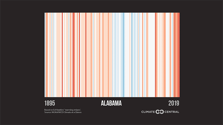
Thursday is the third annual #MetsUnite to #ShowYourStripes. Created by climate scientist Ed Hawkins using annual temperature anomalies (the difference from long-term average), this simple blue-to-red visual has inspired communities around the world. Warming stripes have appeared on cars, murals, light shows, Economist magazines, and much more—not to mention their use by hundreds of meteorologists and climate communicators.
This year, Climate Central has updated these “stripes” graphics for the U.S. states and 160 of our 244 cities (those with 100+ years of data)--adding a stripe for 2019, the world’s second-hottest year on record. Most places show a clear warming trend, especially in fast-warming areas like the Southwest, Northeast, and Alaska. And while recent temperatures were mixed in the U.S., the world had its warmest May on record—virtually guaranteeing another top-5 year for heat. NOAA and NASA’s global temperature data is in, naming 2019 the 2nd hottest year on Earth since records began and making the 2010s the hottest decade on record.
Warming temperatures hit hardest in disadvantaged communities—with health dangers, food and water stress, coastal flooding, economic damage, and threatened ways of life. Curbing these impacts may be the greatest challenge of our time, but solutions exist from renewable energy to cleaner and agriculture. Reducing emissions would limit the warming that drives those impacts—as illustrated by Alexander Radtke’s “stripes of the future”.
Local climate reporting can improve awareness, too. April polling from Yale and George Mason shows that despite the pandemic, Americans’ understanding and concern about climate change has never been higher. A majority are also interested in more climate news stories—and this is a fitting time for them.
Here’s how you can participate:
Download and display your area’s warming stripes on air and/or social media with a message about climate change in your community. Use the hashtags #MetsUnite and #ShowYourStripes.
Update your social accounts with warming stripes images—including a Zoom background and filters for Twitter, Facebook, and LinkedIn.
To get stripes for other countries and the oceans, go to Ed Hawkins’ site at showyourstipes.info. You can also find county stripes from scientist Jared Rennie.
If you’d like to join your colleagues in showing “warming stripes” ties, earrings, face masks, and more on air, click here to purchase an item.
And for even more inspiration, check out the images on Ed Hawkins’ twitter feed—from spinner and spiral animations to beer cans, shower tiling and more.
METHODOLOGY
The “warming stripes” design was conceived by Ed Hawkins, as described here. Stripes for stations and states are based on the anomaly from the 20th century average. For a subset of locations where there was no data until after 1901, the anomaly is based on the oldest 100-year average available for that city. Stations with less than 100 years of data were not included. Station data is from RCC-ACIS and state data is from NCDC Climate at a Glance.
Climate Matters © 2020 by Climate Central is licensed under CC BY 4.0
This license grants permission to use, distribute, and reproduce all text, graphics, and multimedia content published on this page in any medium, provided that Climate Central is credited per the CC BY 4.0 license.
Permission to use data and other materials published on this page is granted for non-commercial uses, commercial news purposes, and educational purposes as governed by Climate Central's Terms of Use.