
News•February 3, 2015
Here’s What the Inside of Greenland Looks Like, in 3D
Want to know what the inside of an ice sheet looks like?
A new 3D map and animation of the Greenland ice sheet lets researchers peer into the layers of ice laid down over millennia and see how they have been warped as they flow over time and are put under pressure as newer layers accumulate above. This will help them better understand how Greenland — which holds enough ice to raise global sea levels by 20 feet — will respond to current climate change by showing how it responded to similar changes in the past.
The map will “give people that gut-level feel of what an ice sheet looks like on the inside,” Joe MacGregor, a glaciologist at the University of Texas and one of the leaders of the mapping effort, said
Marrying Methods
Peering into the opaque white ice that covers Greenland is no easy task; the ice sheet is remote, dangerous and miles-thick in places. Special tools are required to peer into the depths and, effectively, into the ice sheet’s past.
One of the main tools scientists have used are ice cores — long, thin cylinders drilled from the ice. Through these, scientists can run tests on all the chemicals stuck in the various layers to learn what Earth’s atmosphere was like when the snowflakes that became those layers fell thousands of years ago.
RELATEDSurprise Lake Sheds Light on Underbelly of Greenland Ice
Refreezing Water Causes Weird Warps in Greenland’s Ice
Greenland Ice Sheet Melt Could Occur Yearly By 2100
But while cores can give incredibly detailed information about old ice layers, they’re limited to particular locations around a gigantic island that is a little more than three times the size of Texas.
“You learn a lot about a few locations,” MacGregor said. But, “that leaves a lot of ice sheet on the table; in fact, almost all of it.”
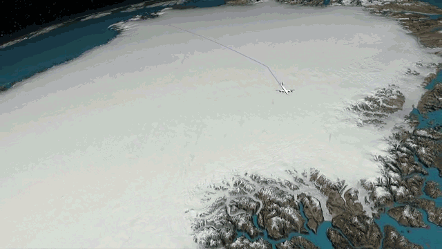
To get a broader picture, researchers use planes to fly radar instruments over the ice sheet in long swaths. The radar can penetrate deep into the ice sheet and reflects differently off different layers and features, painting a picture of the ice sheet’s innards.
Routes taken by radar-equipped flights over Greenland.
Credit: NASA Goddard's Scientific Visualization Studio.
What MacGregor and his colleagues did was marry the two approaches. They used two decades worth of data from radar flights, some of which went over sites where cores had been drilled. The layers in the radar data could be matched with the precise dating from the cores and that information could then be extended over the larger ice sheet.
After a lot of data crunching and time, MacGregor and his colleagues were able to assemble all of the radar and ice core data into the 3D maps, allowing them to see “how the ice flowed and has flowed over a long period time,” he said. The process they used to do this is detailed in a new study in the Journal of Geophysical Research Earth Surface.
Ice Sheet Surprises
The map yielded a few interesting surprises.
MacGregor expected the younger layers on top to be less deformed and twisted than the older layers at the bottom (because they’d experienced less pressure from overlying layers and had less time to be modified). But “I was surprised how sort of monolithically flat most of the top of the ice sheet was,” MacGregor said.
At the bottom, though, “the situation starts to get much messier,” as other studies have shown. A study published in June showed that a complex melting-refreezing process at the base of the ice sheet caused the ice layers to warp, pushing older layers up and younger ones down.
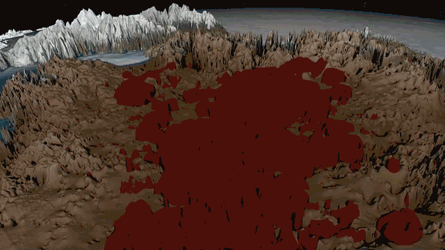
Animation of layers of the Greenland ice sheet.
Credit: NASA Goddard's Scientific Visualization Studio.
“Those are telling us a lot about the strain that the ice has experienced,” MacGregor said, which better informs scientists’ understanding of how the ice sheet flows.
One particular surprise was the amount of ice from the Eemian period of Earth history, which lasted from 130,000 to 115,000 years ago. Glaciologists are particularly interested in that period “because it tells us about climate during a period of warmth similar to the present,” MacGregor said, though the buildup of warmth then was slower than it is today.
MacGregor said that part of the map was “bound to be one of the more controversial aspects of our work” because they had to extrapolate more there and make educated guesses on ice ages based on the layers around it. But he doesn’t think their map is the last word on the subject.
A glacier in east Greenland seen from the P-3 plane used as part of NASA's Operation IceBridge.
Credit: NASA/Jim Yungel

Ian Joughin, a glaciologist at the University of Washington who was not involved in the map effort, said that while he hadn’t read the paper describing the mapping in detail, “It looks like some really nice work showing the value of all the radar sounding NASA has been doing through Operation IceBridge.” (This mission uses planes to bridge the gap between polar observing satellites, hence its name.)
MacGregor hopes he and other glaciologists will be able to use the new maps along with simple models to see if their predictions of how glacial ice will flow match up with what has actually happened in Greenland. They also hope that those working on more complex models of ice sheet behavior will be able to incorporate the information about the ages of different layers the map has produced.
Overall, one of the biggest surprises to MacGregor was that they were able to complete the project at all.
“We did not envision being able to do this at the scale that we did,” he said. But once “it occurred to me that I could do it . . . I kinda had to try.”
You May Also Like:
Everyday Climate Change, Now On Instagram
Accelerated Ice Melt Causing Iceland to Rise
One More Log on the Fire for 2014 As Hottest Year
Obama Orders Rising Seas Built In to Building Standards