News•April 25, 2014
New Ways to Visualize Increasingly Hot Weather in U.S.

By Brian Kahn
The portion of days with warm weather in the U.S. have increased by 25 percent over the past 50 years according to a new data analysis. The analysis draws on publicly available data and represents the tip of the iceberg for how publicly available climate and weather data can be accessed and used.
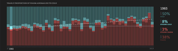
The yearly portion of warm to cold anomalies since 1964.
Credit: Enigma
New York-based open data firm Enigma undertook the analysis. To do it, they dealt with the unenviable task of sorting through more than 860 million rows of data from 90,000 weather stations across the country. Weeding out inconsistent or poor quality data yielded a dataset with about 3 million records from 2,716 stations, which is still enough data to fill 25 gigabytes on a hard drive.
The resulting analysis and beautiful maps and graphs shows that the portion of hot weather days has steadily increased to 67 percent up from 42 percent in the U.S. According to Enigma’s website, that upward trend “is highly significant with a p-value approaching 0.0.” In plain English, that means the odds of the increase in warm and very warm days in the U.S. is extremely unlikely to have happened by chance. Though the exercise doesn't offer any hard predictions, Enigma does note that the if the the trend continues, the U.S. could see that “the yearly proportion of warm anomalies will regularly fall above 70 percent in the 2030s.”
Other research has also shown that the daily record highs vs. daily record lows in the U.S. have been following a similar pattern. In the past decade, daily record highs outpaced lows by 2-to-1, something that’s due in part to rising average temperatures associated with climate change.RELATEDWhite House Brings Together Big Data & Climate Change
NOAA’s New Cool Tool Puts Climate on View for All
Climate Change Is Increasing Extreme Heat Globally
Extreme heat is also growing globally due to climate change. Over the past 15 years, extreme heat events are increasing both in how often they occur and how severe they are.
Of course explaining the analysis isn’t nearly as interesting as seeing it visualized. Enigma’s graphic helps take the reams of data and findings and make it relatable. The effort is in line with a recent push by the federal government to make climate data more accessible.
A map showing warm temperature anomalies.
Credit: Enigma

Last month, climate.data.gov was rolled out as a central piece of the President’s Climate Action Plan. The goal of the site is to house public climate data for app and computer developers, decision makers, and the public. Though Enigma isn’t associated with the plan or climate.data.gov, their analysis of U.S. temperature trends is indicative of the growing effort to liberate data from its sometimes stodgy confines.
Visualizations like theirs are only one vehicle. Connecting climate data with data on agriculture, infrastructure, and energy has the potential to help policymakers see the impacts climate change is having on these and other variables and make more sound decisions.
And if you want all the nuts and bolts behind how Enigma built the map and graphics, you’re in luck. Brian Ableson, the lead data scientist behind them, has a detailed piece explaining the whole process from conception to execution.
You May Also Like
Oklahoma Utilities Hit Homes Using Solar With Extra Fee
Climate Models, Globe’s Oceans Put Stamp on Earth Day
‘Oldest Living Things in the World’ Tell a Tale of Climate
March of Global Warming: Month 4th Warmest on Record